Article Openers
What Are Openers For?
- Sell the story.
- Set up reader expectations about the subject matter, tone, and length.
- Match the editorial weight.
Why We Care About…
Mobile-First
- 57% of our web traffic comes from mobile devices. This is on par with internet usage behavior in general. (Mobile traffic has exceeded desktop traffic since at least 2016, particular in industries like news and ecommerce.) And at least 15% of Americans use phones as their only means of internet usage at home, according to Pew Research in 2021.
- For openers: this means that when making visual choices, or making tradeoffs between desktop and mobile, mobile should take priority.
Dark Mode Support
- About 34% of users opt to use dark mode, according to email vendor Litmus. People choose it for many reasons, from accessibility or comfort, to wanting to conserve battery life on their devices. As with other system-wide user preferences, such as text size, it’s important to respect those choices.
- For openers: if someone is coming to one of our stories from another website or app that’s mostly dark, it’s incredibly jarring to be suddenly encounter a page with a bright image or a large white background.
Low File Size / Load Times
- Images and videos are often the biggest contributor to page load times. On slower internet connections, every 1 MB increases load time by 1 second.
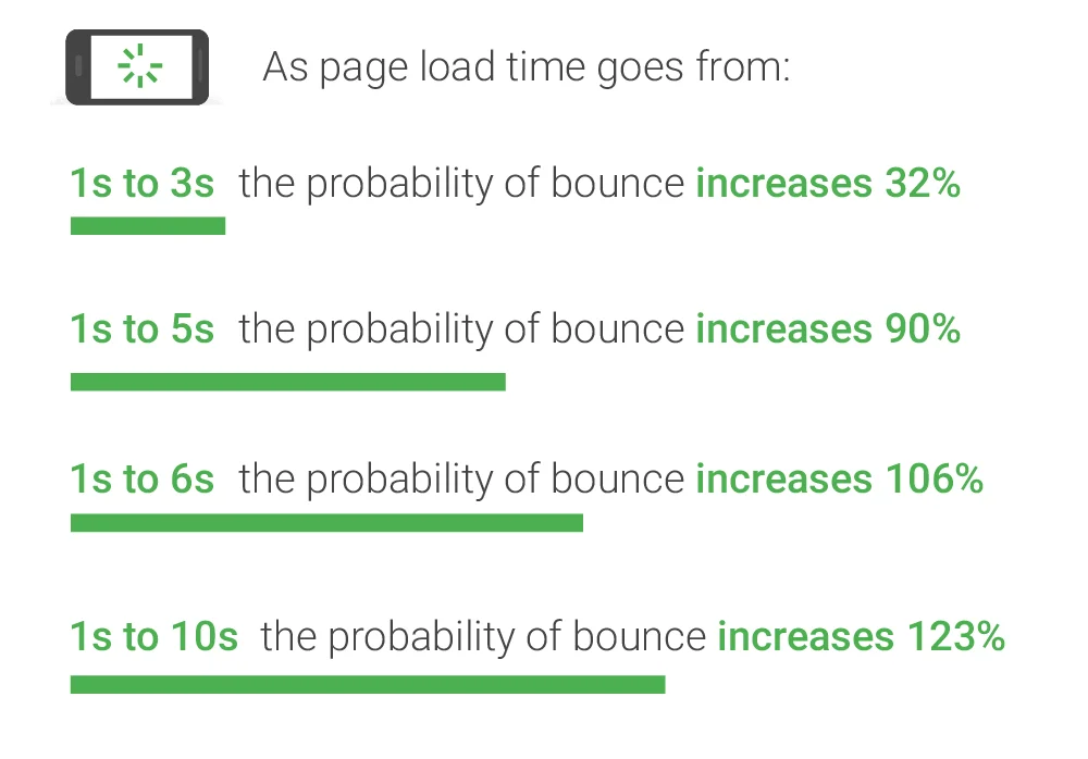
- In a 2017 study by Google/SOASTA, page load times have a significant effect on bounce rates:
-
Google heavily factors page speed in its search rankings. (Particularly, the Largest Contentful Paint metric in Core Web Vitals.)
-
Compared to our news industry peers, we are roughly ~middle of the pack:
- We do better than: The Washington Post, The New York Times, Vox, The Atlantic, and The New Yorker (and others)
- We do worse than: The Markup, Rest of World, The Marshall Project, and The Texas Tribune (and others)
- But it’s worth keeping in mind: our pages compete against all kinds of websites, not just news orgs, in search rankings.
Types of Openers
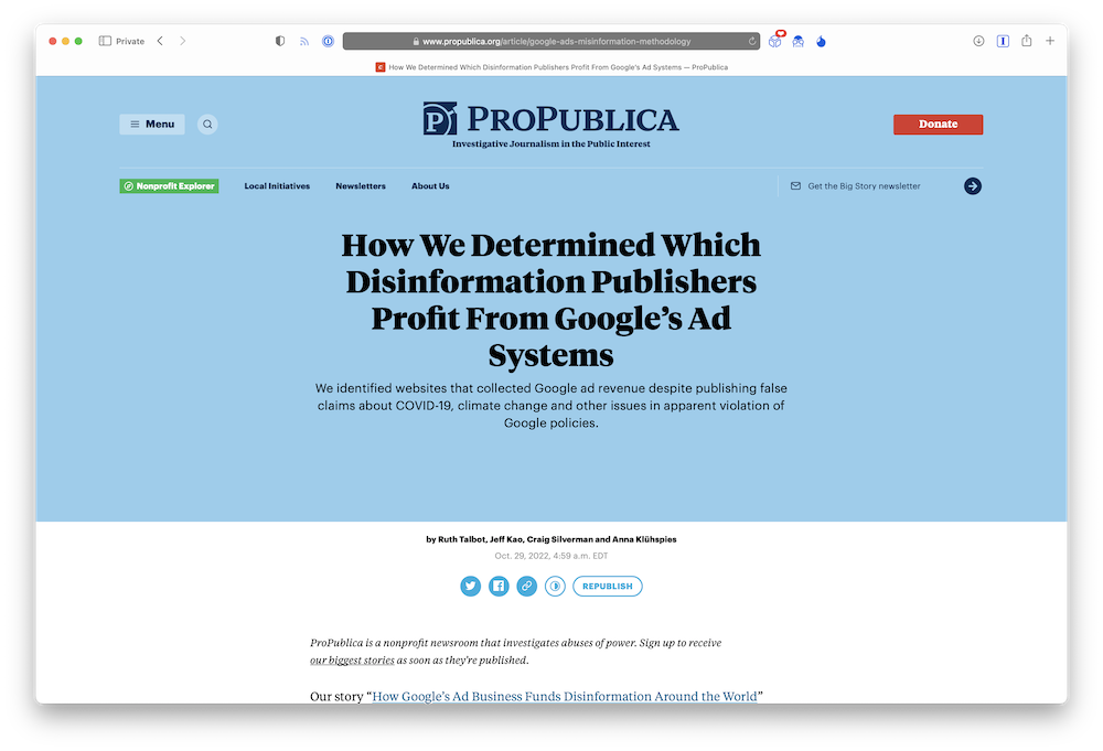
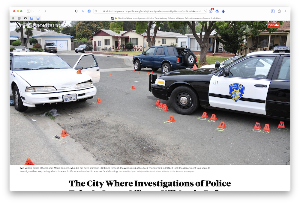
When the art isn’t strong (a screengrab, candid photos with weak composition / lighting, etc).
Best used with landscape or square aspect ratio, avoid using with portrait aspect ratio.
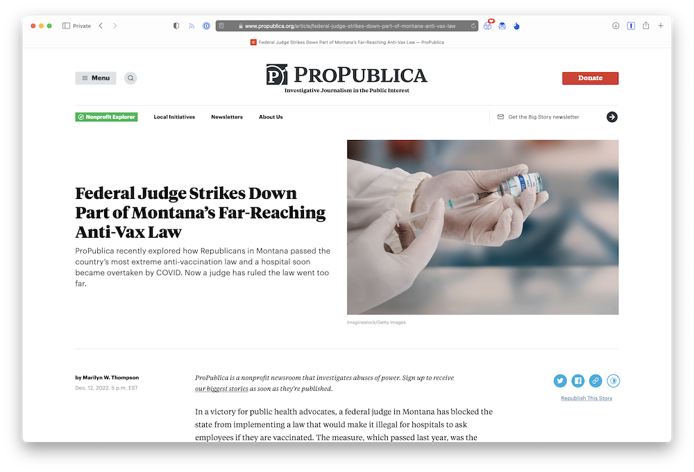
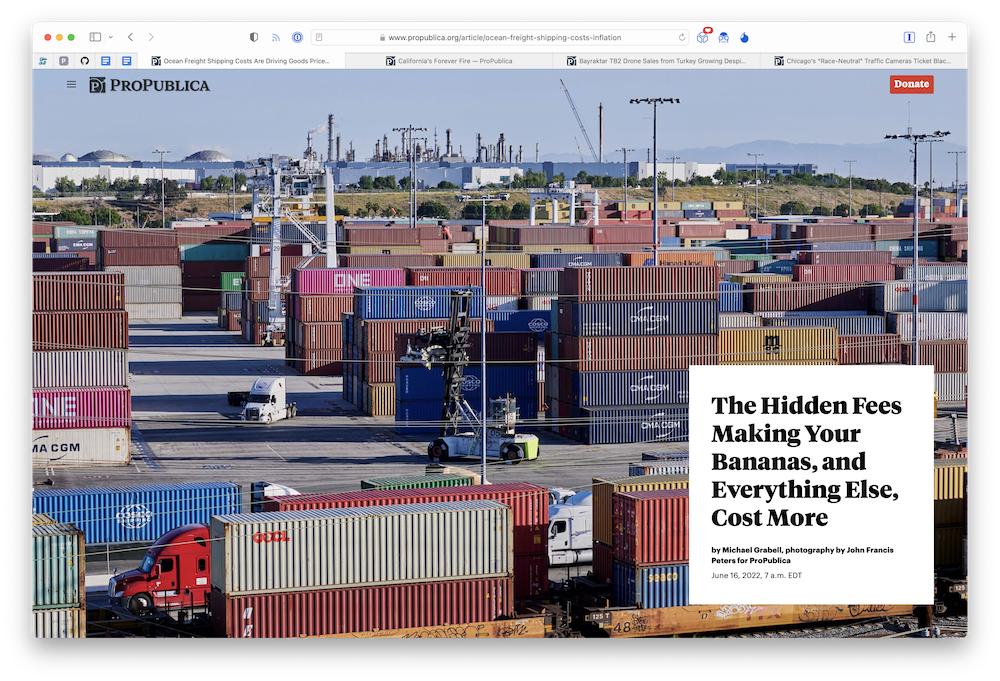
When the art is strong, and the grid opener isn’t workable.
Use with landscape aspect ratio only.
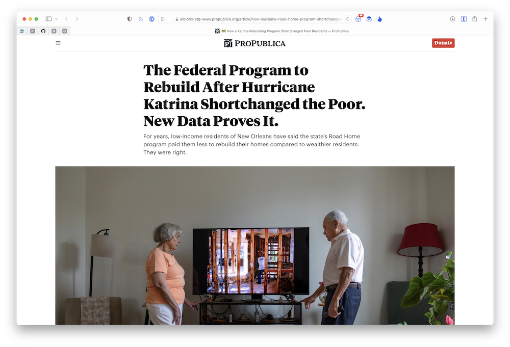
A simplified version of the grid opener, for side-by-side layouts.
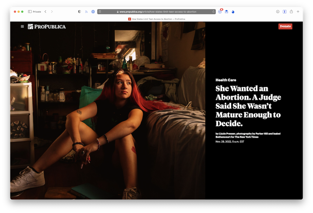
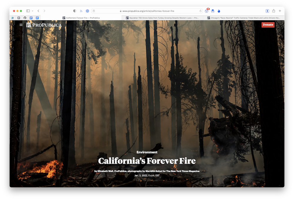
Use for immersion, art that’s expansive, atmospheric, or otherwise visually evocative.
Best used with portrait or square aspect ratio, avoid using with landscape aspect ratio. On mobile, it will always be cropped to a square.
Use for immersion, art that’s expansive, atmospheric, or otherwise visually evocative.
Use when image is very busy or can not be covered by text in any way.
On mobile, art can be any aspect ratio.
On desktop, art should be landscape aspect ratio only.
Use for immersion, art that’s expansive, atmospheric, or otherwise visually evocative.
Choose options that match the aspect ratio of the art. The most flexible type of opener: see guidelines for explanations of each option availble, and consult the design team when you’re considering using this.
When you have a need for something not covered by one of the existing options above.
What Types of Video are Supported?
| Opener Type | Embeds | Cinemagraphs |
|---|---|---|
| Small | ✔ | |
| Medium | ✔ | |
| Large | ✔ | |
| Split | ✔ | |
| Full | ✔ | |
| Grid | ✔ | |
| Custom | Discuss with graphics team | Discuss with graphics team |
- Opener cinemagraphs should be kept short and atmospheric. See the cinemagraphs guide for more info.
- Opener embeds (Youtube/Vimeo) are used for longer, standalone pieces because they offer user playback controls and a robust streaming experience.
We intentionally do not support Youtube/Vimeo embeds in split/full/grid openers, or cinemagraphs in small/medium/large openers:
- The art on Split/Full/Grid openers fill the browser regardless of aspect ratio, so the edges of the art will get cropped. This is incompatible with supporting a video embed with controls without cropping it in some way.

