Logos
Our logo is one of the first things a reader sees when they encounter our work. It’s designed to embody our brand’s personality of well-earned authority, rigor and trust.
Take care to follow the usage guidelines below to ensure its integrity and the consistency of its presentation across all platforms.
Download All Logo AssetsProPublica

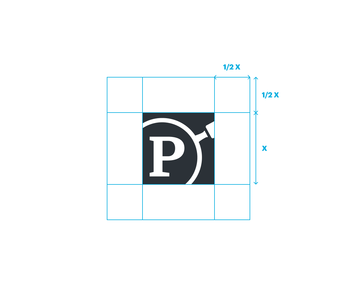
Do not crop avatar for services that use a round avatar.
Upload square version and allow service to modify as needed.
Do’s and Don’ts
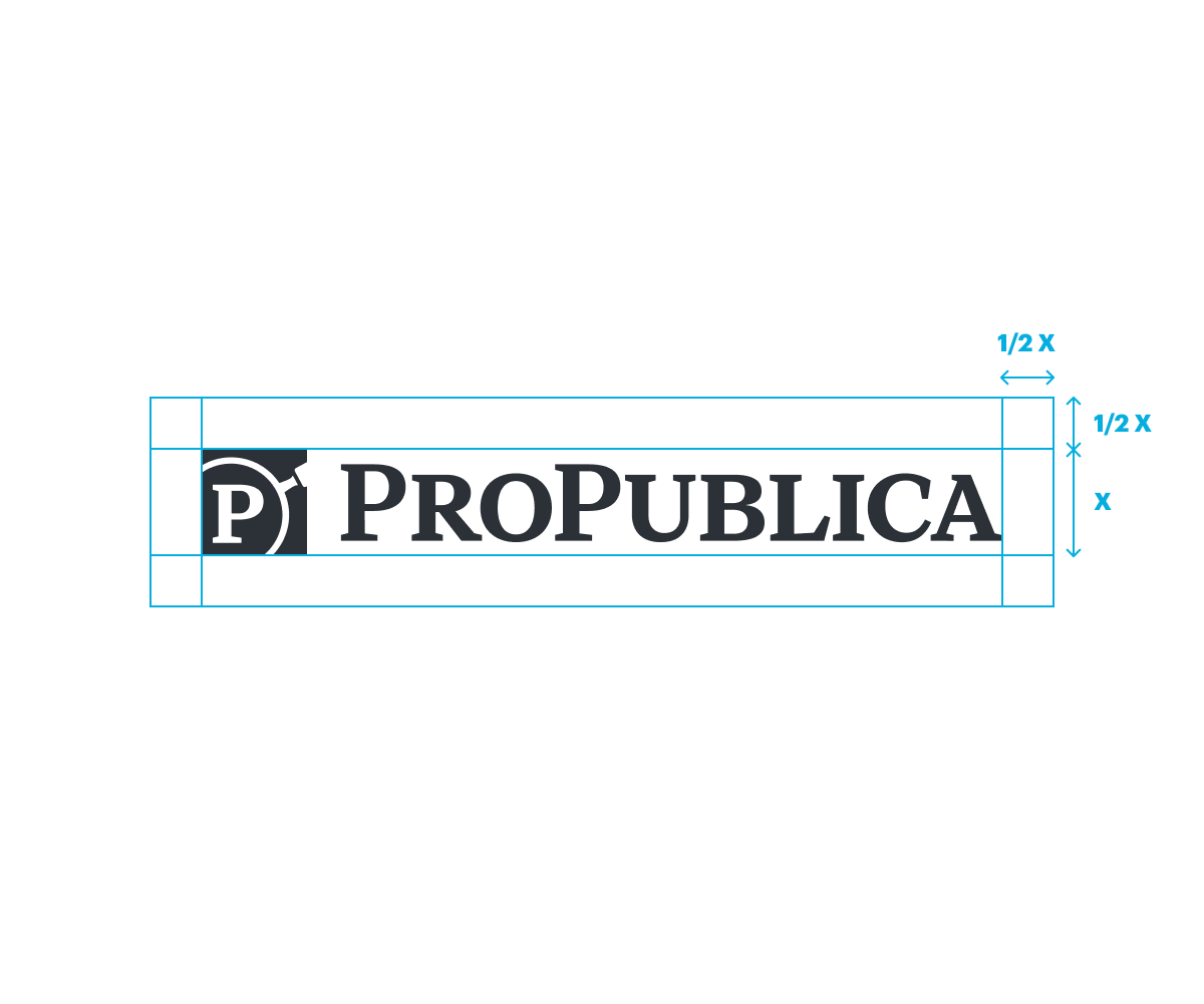
- Don’t alter monogram/logotype spacing or proportions.
- Don’t stretch, skew, etc.
- Don’t bevel, emboss, etc.
- Don’t use logotype without monogram.
- Don’t use monogram without bounding box.
Whenever possible, ProPublica logos should be displayed in their standard dark blue. If displayed on a dark background, a white logo is preferred, and black is acceptable in cases where the dark blue is otherwise unsuitable. The logos should only be displayed in a color other than dark blue, black, or white when the design is composed primarily of spot colors.
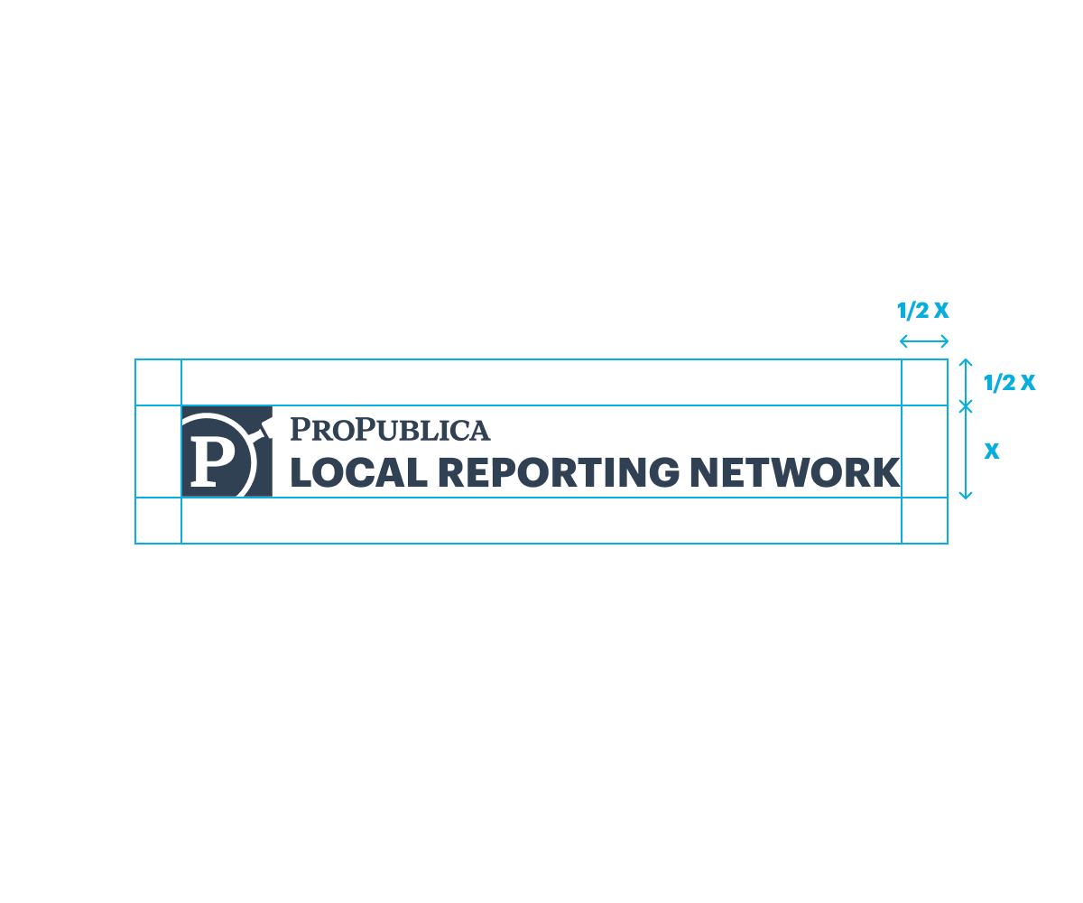
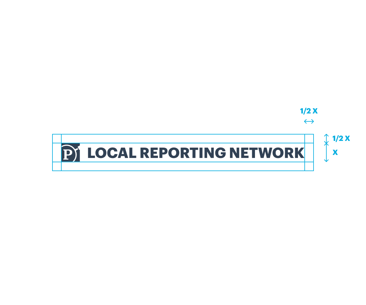
Local Reporting Network

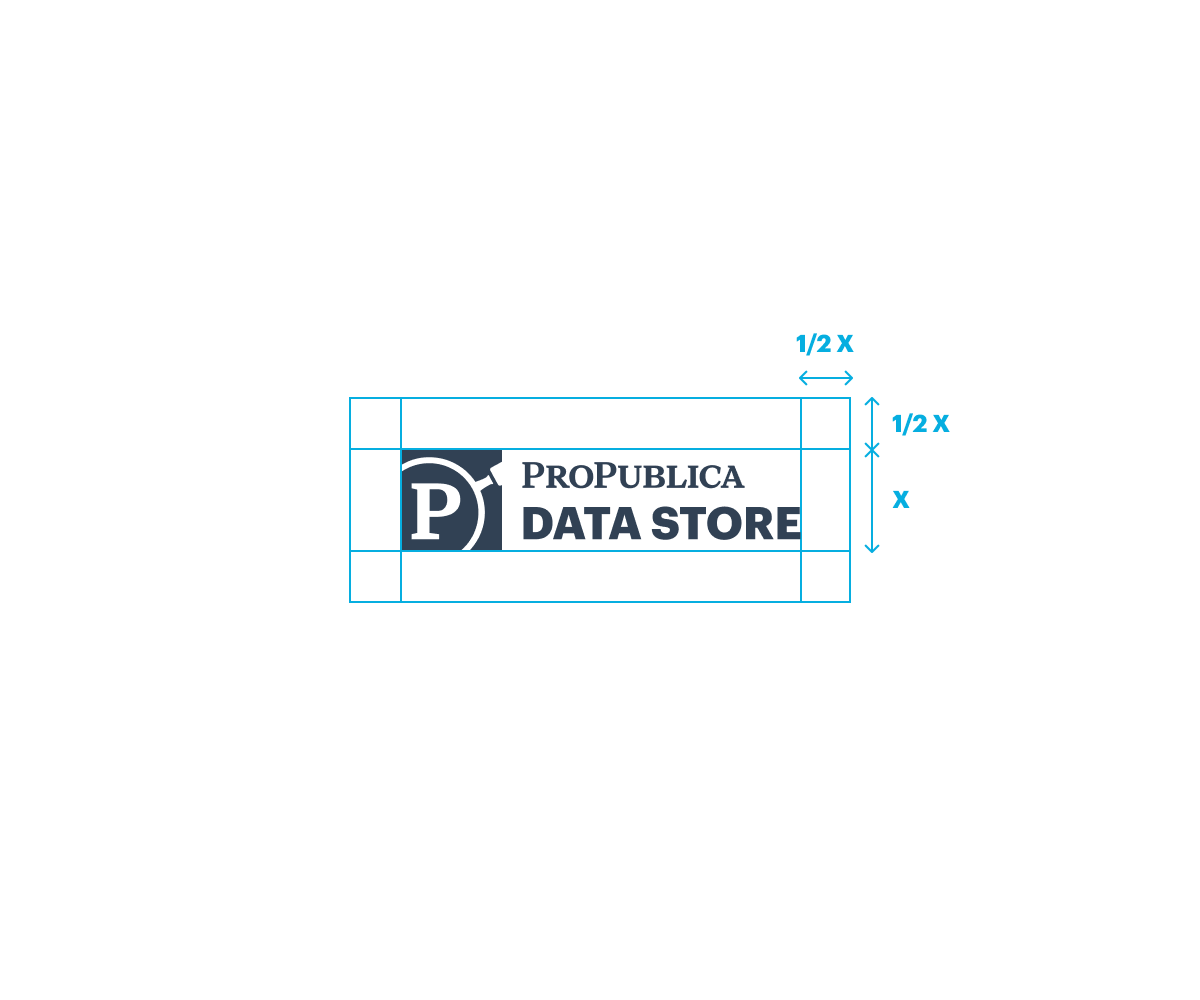
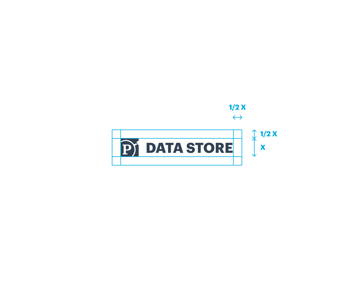
Data Store


Do not crop avatar for services that use a round avatar.
Upload square version and allow service to modify as needed.
Nerds
Do not crop avatar for services that use a round avatar.
Upload square version and allow service to modify as needed.